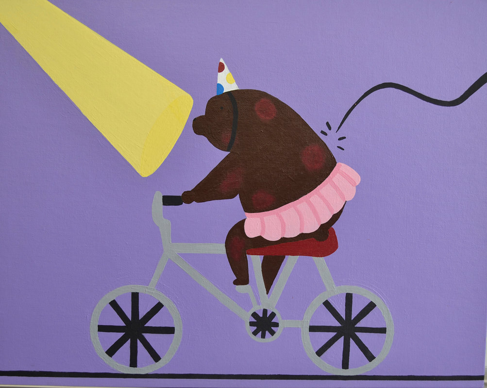
"Beary Scary"
|
This piece was inspired by David Hockney’s clean linework and simple color schemes and Carl Fabritius’s solid backgrounds. I incorporated Hockney’s techniques by using curvy and straight lines to make the bike, whip, and studio light. I also kept my color scheme simple, using mostly black, grey, brown, and purple. I did this so the audience wouldn’t be distracted from the theme of my artwork which is animal cruelty within entertainment. Like Fabritius, I kept my background a plain purple.
|
"Beary Scary"
Acrylic paint on canvas
16in x 20in
2019
Acrylic paint on canvas
16in x 20in
2019
"Honeycomb"
|
For this piece, I wanted the audience to understand the importance of bees in the ecosystem by showing infected honeycomb. Bees are important to the ecosystem because they help pollinate our food. I chose to make the infected honeycomb green because the color green is usually associated with illness. To make the healthy honeycomb stand out against the infected honeycomb even more, I added a glossy top coat and white highlights to the healthy honeycomb.
|

|
"Honeycomb"
Acrylic on Canvas
16in x 12in
2019
Acrylic on Canvas
16in x 12in
2019
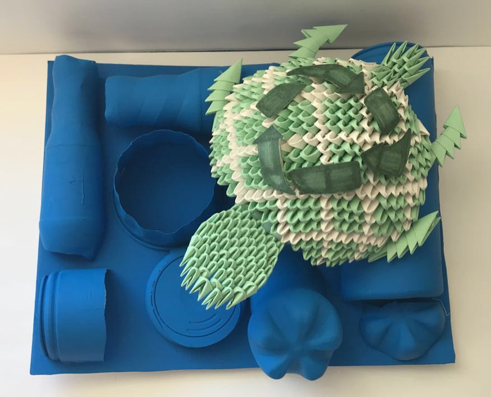
"Plastic Casualty"
|
In this piece, I wanted to depict how littering impacts sea life. I chose to make my turtle out of origami to represent how the garbage that you discard is often ingested by sea-life. I was visually inspired by Louis Nevelson, an artist who uses a variety of different objects which are painted the same color to create one cohesive piece. I chose to incorporate this technique by painting different plastic objects the same color to represent the sea.
|
"Plastic Casualty"
Origami, plastic, and paint
2019
13.5 in x 11.5 in x 5.5in
Origami, plastic, and paint
2019
13.5 in x 11.5 in x 5.5in
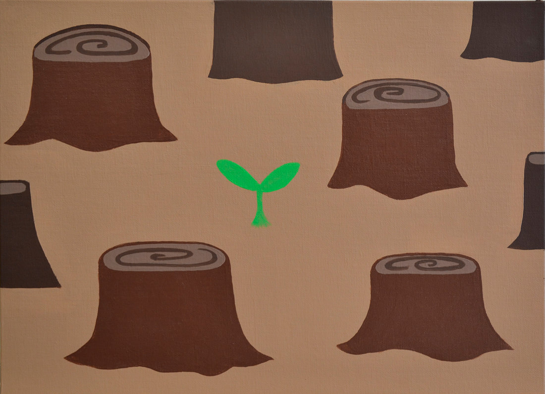
"Deforestation"
|
In this artwork, I wanted to depict how deforestation continues to occur and how, if we continue to do nothing about it, it will eventually have a negative impact on the Earth. I chose to surround a sprout by dead trees to show that the amount of trees being planted is nothing in comparison to the amount being destroyed. I decided on a simple color scheme so as not to distract the audience from the concept of my art piece.
|
|
"Deforestation"
Acrylic on Canvas
16in x 12in
2019
Acrylic on Canvas
16in x 12in
2019
