|
|
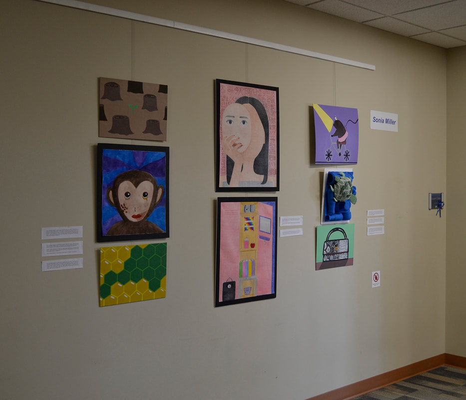
Curatorial Rationale
My body of work has moved through several different ideas, some of which were cruelty within poverty, hunger, and race. Although my works differ in subject matter, they all share a decorative style that I developed during my IB art experience. One of the common themes throughout the majority of my artworks is the theme of cruelty. I chose cruelty because of my interest in fast fashion and the effects that it has on animals and the way that they are treated within the fashion industry. As someone who is interested in fashion and loves animals, I wanted to understand some of the downsides within the industry and the effect that animal cruelty has on it. Through my selected works I hoped to show the audience that cruelty can be seen in many different areas, and that by bringing awareness to these situations it can help prevent them from happening in the future. Therefore leading to the prevention of some of the particular issues within cruelty I focused on the beauty stands and the treatment of animals within entertainment and science. For example, in my project about culture I did this by drawing a woman holding a mask with the face that people within Asian culture would assume as beautiful. Behind her are words that women in Asian culture commonly hear about their beauty.
The topics of the artworks that I decided to display were deforestation, animal testing, endangerment of the bees, cultural beauty standards, five senses, cruelty within entertainment and fashion, and pollution in the ocean.
I have explored these topics through different media, including acrylic paint, watercolor, colored pencil, and mixed media. Through these different media, I used acrylic to paint the most because many of my selected artists that I researched used acrylic paint which inspired me to try and enhance my skills. All the media that I chose had a variety of colors because I believe that it would help my audience understand my artistic intentions better. Some of the artists that helped inspire my chosen style would be Micheal Craig-Martin and Patrick Caulfield. Both of these artists maintain a simple style throughout their artworks. I tried to exhibit this style through my solid colored background, usage of no shading, and bright colors.
Some of the strategies that I developed to help the viewer better understand my work was that decorative style, centered design, and color scheme. By using a solid and blank background and placing my depicted subjects in the center, I wanted to draw the viewer's attention to the main subject in my pieces. By manipulating color schemes in my works and including an image of the object that symbolizes the source of pain, I wanted to spark empathy in my audience towards the depicted subjects. For instance, in my culture project, I wanted to represent the harsh beauty standards within Asian culture and the effects that these standards have on women.
My vision for presenting this body of work is to place the works similar in size, color scheme, and design together, creating a visual balance in the display. I arranged my selected artworks in a grid-like pattern, alternating the size of my works to create a visually interesting display. This grid pattern also helps to emphasize the unity in style and theme among my works, inviting the viewer to follow my visual narrative vertically and horizontally (looking at one column at a time).
